Colour is one of the most powerful tools in an interior designer’s arsenal. It has the ability to influence our mood, alter our perception of space, and even affect our physical well-being. Understanding colour psychology and how to apply it effectively in interior design can transform a house into a home that not only looks beautiful but also feels harmonious and supports the well-being of its inhabitants.
The Basics of Colour Psychology
Before diving into specific colours and their effects, it’s important to understand the basics of colour psychology:
1. Warm colours (reds, oranges, yellows) tend to energize and stimulate.
2. Cool colours (blues, greens, purples) generally have a calming and relaxing effect.
3. Neutral colours (whites, greys, beiges) provide balance and can amplify the effects of other colours.
Now, let’s explore how different colours can be used in interior design to create specific atmospheres and emotional responses:
Red: The Colour of Energy and Passion
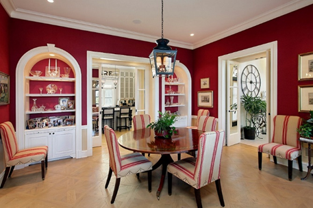
Red is a powerful, attention-grabbing colour that can increase heart rate and stimulate conversation. It’s often associated with excitement, strength, and confidence.
– Best used in: Dining rooms, exercise rooms, or as an accent in social spaces.
– Caution: Too much red can be overwhelming and may increase aggression or tension.
Blue: The Colour of Calm and Serenity

Blue is often associated with calmness, stability, and tranquillity. It can lower blood pressure and slow respiration and heart rate.
– Best used in: Bedrooms, bathrooms, or any space intended for relaxation.
– Tip: Lighter blues can make a room feel more spacious, while darker blues can add depth and intimacy.
Yellow: The Colour of Happiness and Optimism
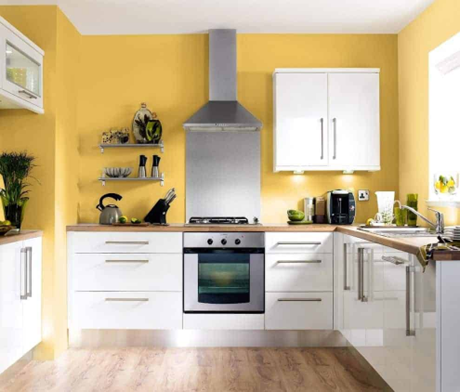
Yellow is associated with sunshine, energy, and optimism. It can stimulate mental activity and generate feelings of happiness.
– Best used in: Kitchens, home offices, or creative spaces.
– Caution: Too much bright yellow can cause eye strain and create feelings of frustration.
Green: The Colour of Nature and Balance
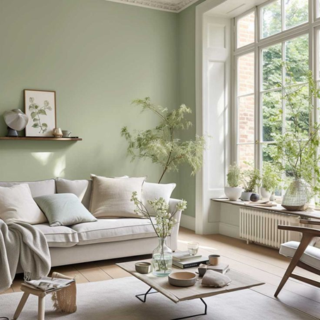
Green is associated with nature, growth, and harmony. It can promote a sense of balance and is easy on the eyes.
– Best used in: Living rooms, bedrooms, or any space where you want to create a balanced, refreshing atmosphere.
– Tip: Combine different shades of green with natural materials for a calming, organic feel.
Purple: The Colour of Luxury and Creativity
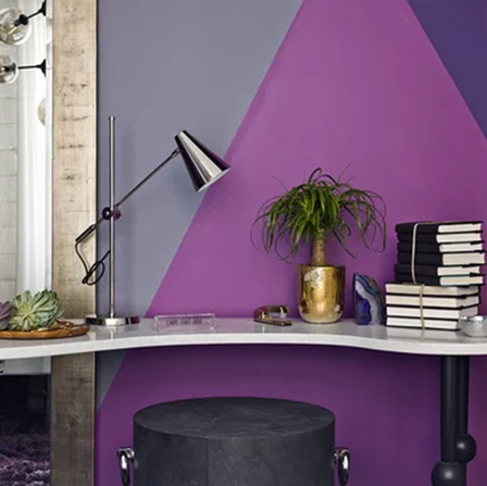
Purple is often associated with royalty, luxury, and creativity. It can stimulate imagination and contemplation.
– Best used in: Home offices, art studios, or as an accent in bedrooms or living rooms.
– Tip: Deep purples add drama and sophistication, while lavender hues are more soothing.
Orange: The Colour of Enthusiasm and Sociability
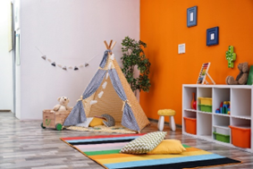
Orange combines the energy of red with the cheerfulness of yellow. It’s associated with enthusiasm, adventure, and sociability.
– Best used in: Exercise rooms, play areas, or as accents in social spaces.
– Caution: Too much orange can be overwhelming; use it in moderation.
Brown: The Colour of Earth and Stability
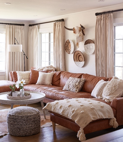
Brown is associated with nature, stability, and comfort. It can create a sense of security and groundedness.
– Best used in: Living rooms, studies, or anywhere you want to create a cozy, stable atmosphere.
– Tip: Combine different shades of brown with creams or greens for a natural, earthy palette.
White: The Colour of Purity and Spaciousness
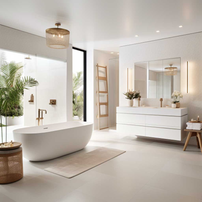
White is associated with cleanliness, purity, and spaciousness. It can make a room feel larger and brighter.
– Best used in: Small spaces, bathrooms, or as a base colour in any room.
– Tip: Use different shades of white and interesting textures to add depth and avoid a sterile feel.
Black: The Colour of Sophistication and Drama
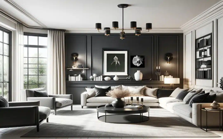
Black is associated with power, sophistication, and drama. It can add depth and create striking contrasts.
– Best used in: As an accent colour or in spaces where you want to create a dramatic, intimate atmosphere.
– Caution: Too much black can make a space feel small and oppressive.
Applying Colour Psychology in Your Home
When applying colour psychology to your interior design:
1. Consider the function of the room and the mood you want to create.
2. Think about the natural light in the space and how it will interact with your chosen colours.
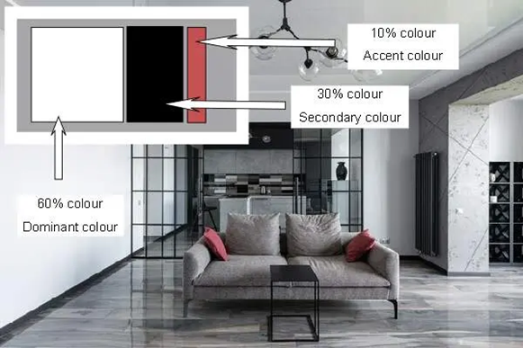
3. Use the 60-30-10 rule: 60% dominant colour, 30% secondary colour, and 10% accent colour.
4. Test colours with swatches or samples before committing to a whole room.
5. Remember that personal preferences and cultural associations can influence how we perceive colours.
Colour psychology in interior design is a powerful tool for creating spaces that not only look beautiful but also support our emotional and psychological well-being. By understanding the effects of different colours and how to use them effectively, you can create a home that truly nurtures and inspires you.
Remember, while these guidelines are based on general psychological principles, individual experiences and cultural backgrounds can influence how we perceive and react to colours. The most important thing is to create a space that feels right for you and supports your lifestyle and well-being.
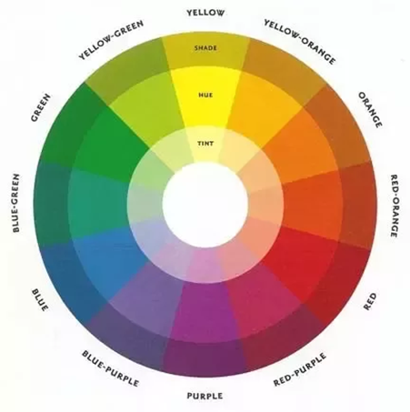
Before diving into specific colours and their effects, it’s important to understand the basics of colour psychology:
1. Warm colours (reds, oranges, yellows) tend to energize and stimulate.
2. Cool colours (blues, greens, purples) generally have a calming and relaxing effect.
3. Neutral colours (whites, greys, beiges) provide balance and can amplify the effects of other colours.
[Picture reference: A colour wheel showing warm, cool, and neutral colour groupings with brief descriptions of their psychological effects.]
Now, let’s explore how different colours can be used in interior design to create specific atmospheres and emotional responses:


